After closely examining the 2014 World Cinema Project/L’Immagine Ritrovata restoration of Sergei Parajanov’s The Color of Pomegranates and the same archival print that they consulted as a color reference, I am sorry to report that the restoration significantly departs from the look of the reference print. It also does not match the other 35mm prints I have seen over the years. In addition, the restoration has some problems with the soundtrack, which I will describe below.
In fact I have harbored reservations for some time about the overall color scheme, despite my excitement about seeing the film preserved and restored in its original Armenian release version. In retrospect, I probably should have been more willing to share these misgivings in a public forum, but I felt that it was best to keep an open mind about the color until I could examine the reference print myself.
The Color Reference Print
The Harvard Film Archive holds two 35mm prints of The Color of Pomegranates, both unsubtitled prints of the Yutkevich version, on Orwo stock and dating from the early 1970s. I visited the archive in early April 2018 in conjunction with another project and studied both of the prints.
The print that L’Immagine Ritrovata used as a color reference was Harvard Film Archive Item No. 1601, from the Bill Pence Collection. It was struck on Orwo stock with a brown soundtrack. (See Jürgen Kellermann’s comments on Orwo film stock.) In addition to examining entire the reference print closely on a Steenbeck table and frequently pausing to study individual shots, the following day I watched the first reel again alongside the restoration to confirm what I was seeing.
The print is in very good condition, with relatively little wear except at the reel changes. The color is also very good, although there is a slight bluish tint on the left side of the frame in reel 1, more visible in some shots than others. It may be either a product of fading or a flaw in the original lab development.
In my view, the print fits with Kellermann’s comments about the typical fade characteristics of Orwo stock. There is almost certainly some fading given its age. This appears to have resulted mainly in a somewhat paler image, but the color remains well balanced. To compensate for this in color correction, arguably one could go for a slightly deeper and richer tone than is present on the print, although the basic color balance should be maintained and the film should retain its overall bright and even appearance, which fits with the other 35mm prints that I have seen.
Due to the rich and well-balanced contrast range in the print, the lighting often creates a sense of spatial depth, more so than I recall on other 35mm prints and the older video versions. This is especially true in the scenes shot in the studio, as opposed to on location. The image is often lustrous. Some shots have always looked more washed out or flat than others, which partly has to do with how they were filmed and is in some cases is likely intentional.
Generally there is not a strong color cast in the image. The whites in the image tend to be very pure, which is not surprising considering how the visual design of the film emphasizes white, red, gold and black as symbolic colors. That is to say, whites should be white for the most part. Some shots with gold in them may have had the yellow pushed to bring out the gold tones, but the effect is not too obvious. Occasionally, in the repeated images joined by jump cuts there is a very slight color shift, but such differences are minimized in the grading. The film tends to avoid very deep blacks. In most cases, there are details and highlights visible in black costumes except where black velvet is used.
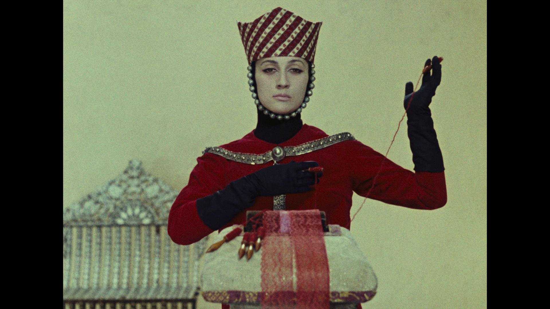
The color red obviously plays a crucial symbolic and aesthetic role in the film, and in fact the reference print displays a wide range of red tones in both the costumes and the objects. I will say more about this later in conjunction with the color grading of the L’Immagine Ritrovata restoration.
Despite the vagaries of the film stock which Parajanov and his cinematographer Suren Shahbazyan had cope with, on this print the flesh tones are well balanced. They tend to be on the light side, even very pale in many shots. In fact, I was surprised at how much some of the inconsistencies in flesh tones that I have noticed previously were minimized by careful grading. There are several obvious exceptions where the characters are wearing stylized makeup, such as Princess Ana’s white makeup at the beginning of the court episode and in the beginning of Sayat-Nova’s dream.
The second print in the Harvard collection (HFA Item No. 14104) is more heavily worn and quite faded – there is almost no blue left in the image – and thus it is probably not suitable as a reference print.
Still, when considering this particular print (HFA Item No. 1601) as a color reference, it is important to note that it represents the version re-edited by Sergei Yutkevich, which was done initially without Parajanov’s authorization. Because of this, the film’s color scheme also may have undergone changes compared to the original Armenian release version. With that caveat in mind, there may be no remaining original Armenian release prints that have quite the same high-quality color. Thus it seems more than reasonable to use this as a reference print. It certainly brings out the inherent beauty of the film’s images.
Problems with Color in the Restoration
The most obvious problem with the restoration’s color grading is the overall teal or yellowish tints to most of the shots. To be sure, these color shifts are more obvious in some scenes than others, and some shots actually do not look bad. But these color shifts are nonetheless apparent throughout most of the film. Another problem is the restoration’s rendering of the reds. In a number of cases they are too dark and intense and do not represent the full range of reds visible in the print.
The images below are screen captures from the Second Sight Blu-ray, which is for all intents and purposes identical to the DCPs that I have seen of the restoration. Since the thumbnails may shift the color slightly, anyone wishing to study the full-sized 1920×1080 resolution images should download them.
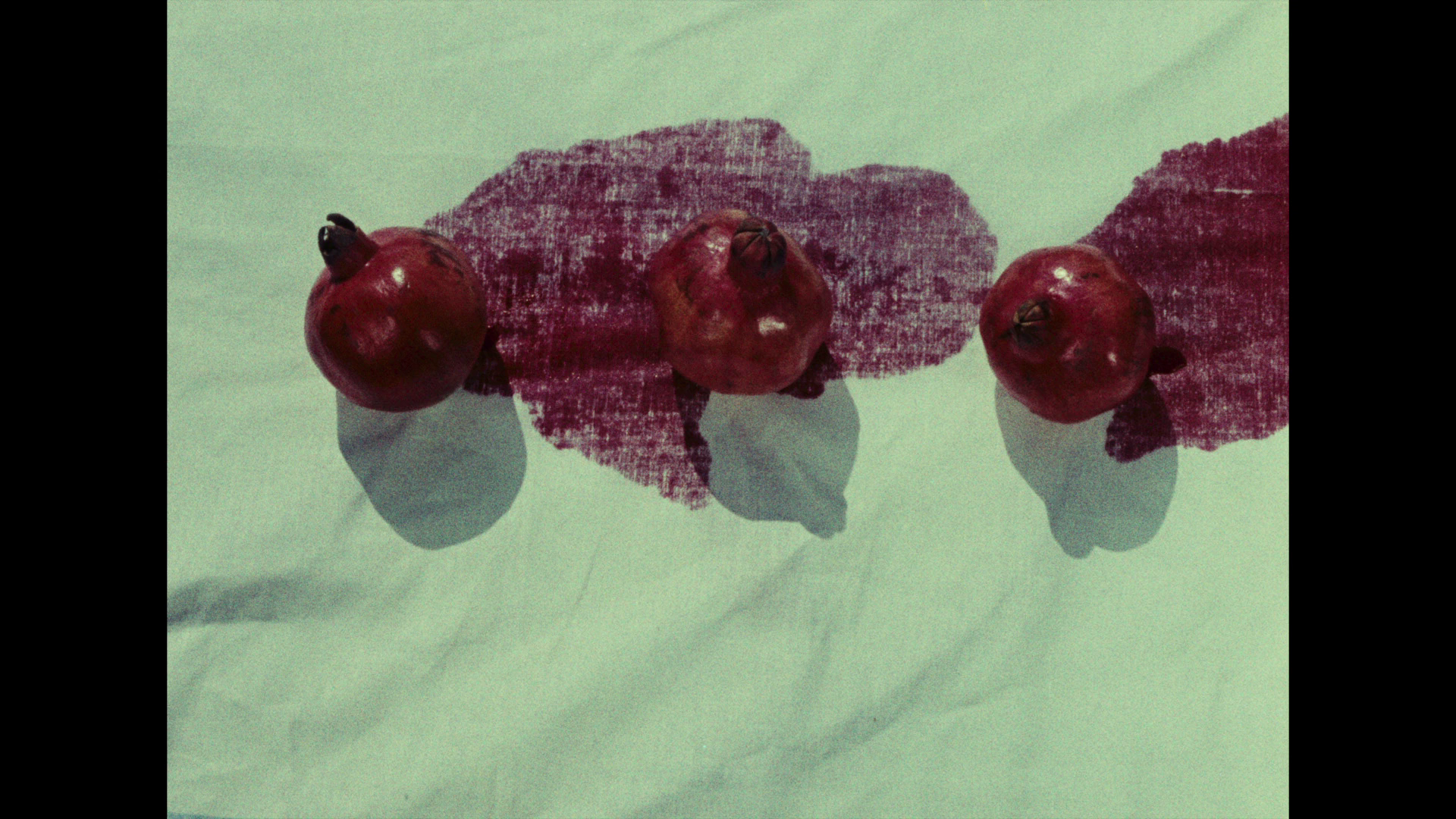
The iconic image of three bleeding pomegranates in the prologue suffers from a teal hue, visible especially in the linen. The best 35mm prints that I have seen, including the reference print, render the linen as more of a pure white. The image should be brighter overall, and the pomegranates should not be such a deep red. They should have a lighter, more naturalistic color.
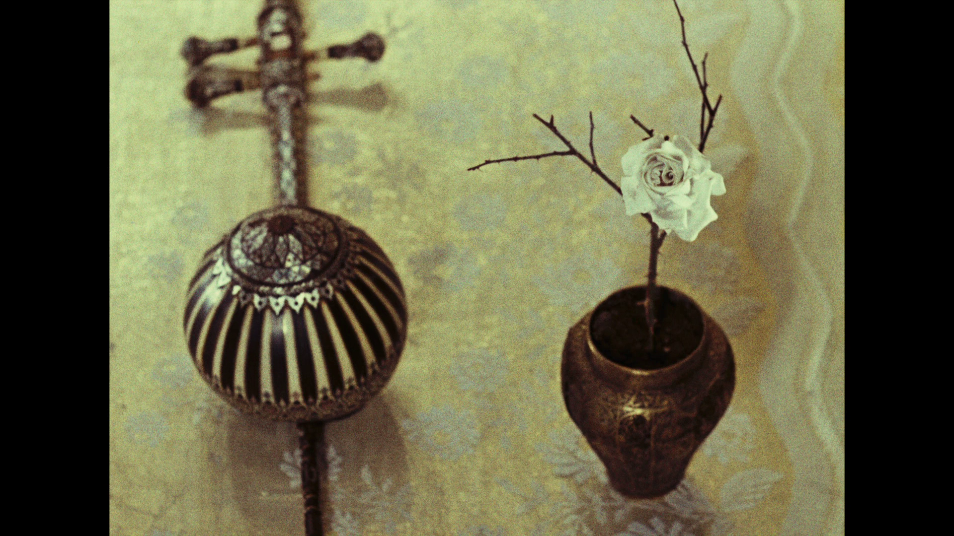
Another shot in the prologue, that of the poet’s kamancha lying next to a vase with a white rose on gold brocaded cloth, has an overly intense yellow hue compared to the reference print. Both the rose and the ivory inlay on the kamancha should be more of a pure white.
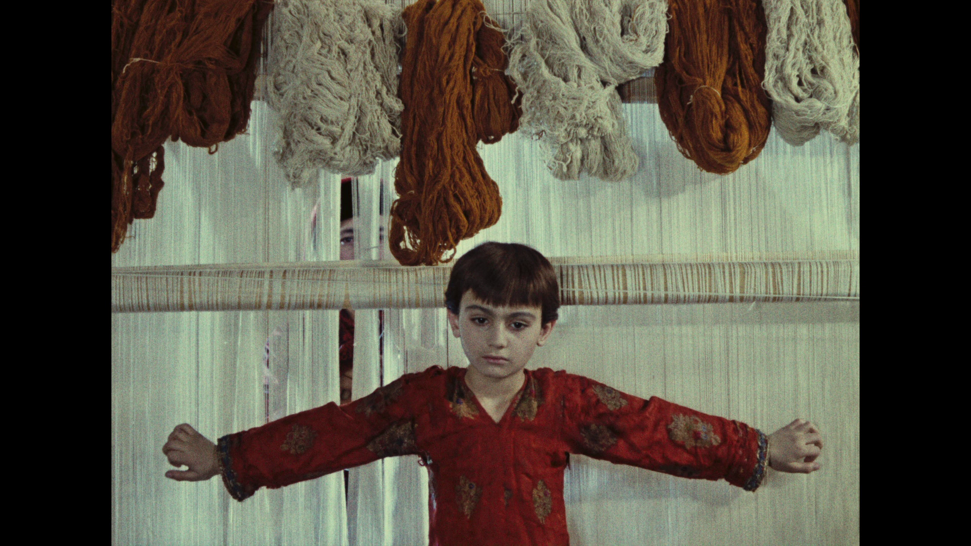
The image of the young boy Arutin posted in front of the white strings of a weaving frame is an example of where the teal hue is not as obvious. Nonetheless, it should also be more white, and the red in is shirt is too dark and intense. Here and elsewhere, the shirt should be more scarlet – that is, a lighter red with some orange visible in it. Several other costumes that should be scarlet are also overly dark in the restoration, though in other cases the reds in the costumes more closely match those of the reference print.
This image of Princess Ana is another example of a shot visibly affected by the teal bias. In this case, the wall in the background should be light tan, and the skin should have more of a natural (though pale) flesh tone to match the reference print.
There is one important exception to all of this. In the shot near the end of the film depicting smashed pomegranates lying next to a dagger, the linen for some reason has always had a very light greenish tone. This is also true of the color reference print, and it probably should be left as is during color correction.
One should note that this is not the first L’Immagine Ritrovata restoration to receive criticism for an unnatural teal or yellowish color scheme. Another high-profile example is Ermanno Olmi’s The Tree of Wooden Clogs, which was released on the Criterion Collection as is. Fortunately, it was re-graded for release in the UK by Arrow Video. You can see screenshot comparisons of the two versions on DVD Beaver.
Problems with the Soundtrack in the Restoration
Here it is important to keep in mind that the film’s composer, Tigran Mansurian, constructed the entire soundtrack as an integral musical composition to accompany the film. He has also gone on record in an interview saying that he was unhappy with Sergei Yutkevich’s alterations to the soundtrack. Thus, when restoring the Armenian release version one should adhere as closely as possible to the soundtrack as presented on prints of that version.
In the shot beginning 33:55 in the restoration, there is an obvious mistake. Drumming from another shot has been accidentally overlaid on top of the existing drumming that belongs in the shot. It took repeated viewings of the restoration and careful listening to the audio to figure out what had happened here.
In the shot beginning 58:31 in the restoration, the image of the church cupola crashing against a rock cliff is supposed to be silent, one example of Mansurian’s strategic use of silences on the soundtrack. Unfortunately, the restoration has retained the gong effect that Yutkevich added.
During the sequence in which the party of people in mourning repeat the phrase “The world is a window” (“Ashkhares me panjara e”), in the shot beginning 1:11:07 there should be a third, deliberately incomplete iteration (“Ashkhares…”). This audio is missing from the restoration.
Lastly, when I first saw the restoration in Bologna and Yerevan in 2014, the audio in the final episode was a few seconds out of sync, though that error was subsequently corrected on the DCP after I pointed it out.
There may well be other discrepancies in the restoration, but these are the most obvious examples that I spotted. Fortunately, both home video releases (Second Sight in the UK and Criterion Collection, USA) of the restoration have fixed these audio discrepancies as much as possible, but the underlying restoration still needs to be fixed as well.
Conclusion
While I regret not being more open about my private misgivings regarding the overall color scheme of the restoration, I stand by my earlier assertion that the World Cinema Project/L’Immagine Ritrovata restoration brings out color and detail that has not been visible before thanks to its 4K scan of the original camera negative. Yet in the final analysis, it is not what it could have and should have been. We still do not have a definitive or near-definitive restoration of the film. The color grading and soundtrack should be redone, either by L’Immagine Ritrovata or by someone else in a future restoration.
I also hope that someday we will see a home video version which more or less authentically reflects the film’s original color scheme. That is not the case at present. This is in no way to fault Second Sight and the Criterion Collection, who have released the film on home video. From what I understand, they are contractually obligated to use the video master supplied to them. Furthermore, both editions reflect a tremendous amount of thought and effort in terms of contextualizing supplements. Nonetheless, is unfortunate that we still do not have a reasonably authentic visual presentation of the film either on home video or on DCP. To my mind, this is the most important thing of all, and I hope that someday it will be rectified.
Update – 4/11/18
A few of my colleagues have speculated that the color shifts may have to do with problems in color management workflow at the restoration facility. Thus, for instance, it is possible that the colorist may be visually matching the color on the reference prints, including for this particular restoration, but a LUT somewhere in the workflow may shift the color on the actual output.
Thanks for all the new information. I was wondering what had happened to you! I have the new Blu-Ray – all I need now is the equipment to play such things. A couple of questions: first, how’s the biography going? Any idea when it might appear? Also, do you know anything about the extras with the Artificial Eye issue of “Ashik Kerib” ? There’s no information given at all, which is odd.